
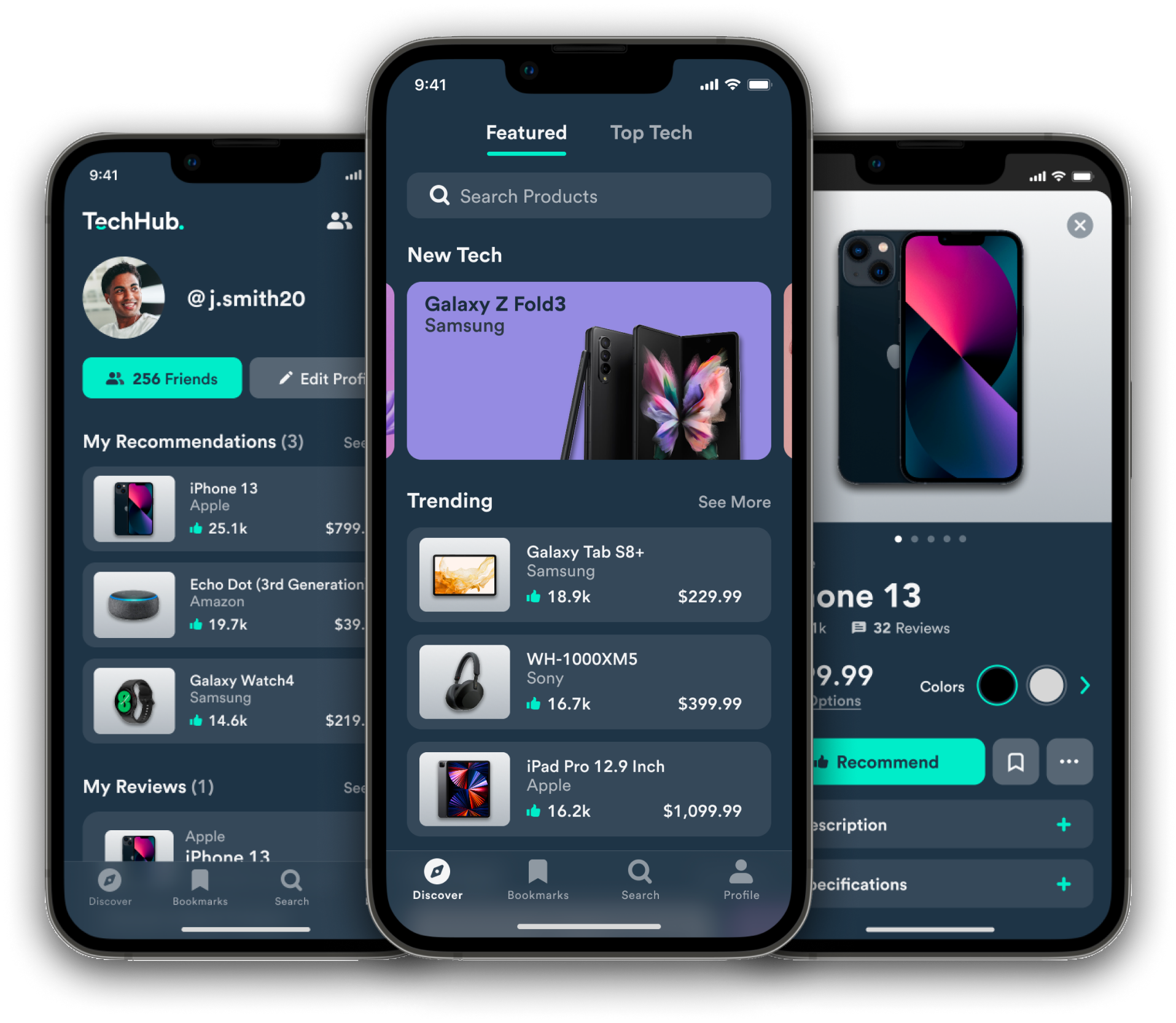
TechHub is a community-based platform that gathers detailed information on the latest tech products.
Users engage in the community by recommending their favorite devices and sharing their reviews. Tech products that are highly recommended by the community increase their discoverability.
TechHub makes finding the right tech product simple and efficient.
My Role
End-to-End Product Designer
Project Scope
• Mobile Application
• 5-Month Timeline
• Passion Project
Team
Solo Project
Tools
• Figma
• Miro
Process

Problem
Searching for the right tech product can be a tedious process.
As consumer electronic brands continue to make leaps forward in technological advances, the number of tech products entering the market constantly grows. For users interested in finding an ideal tech product, the overwhelming amount of selection can be difficult to sort through.
Challenge
How might we make the tech product research
experience more efficient?
With so many tech products to choose from in today's market, users need a way to discover the right gadget that fits their needs.
Solution
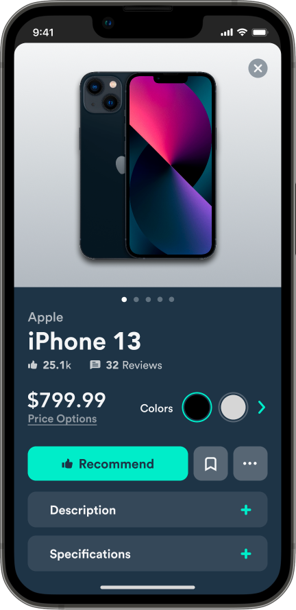
An all-in-one platform that streamlines the research process.
TechHub is a mobile application that improves the tech product research experience by reducing the number of channels used when finding the right tech.
01 Understanding the User
Competitive Analysis
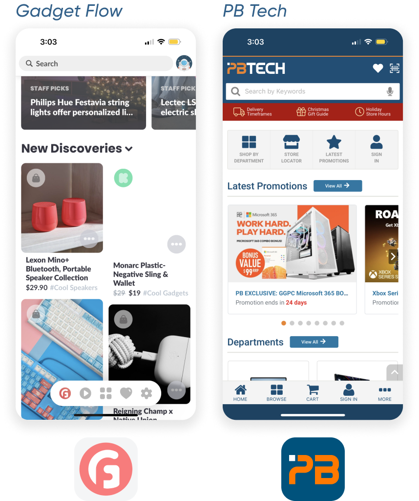
Conducting competitive analysis helped identify existing sites and apps users currently visit to guide their research process. Examples of existing apps/sites include:
User Interviews
Online surveys were completed to target potential users that would fit within this project’s demographic. From the results, user interviews were conducted in an effort to learn about:
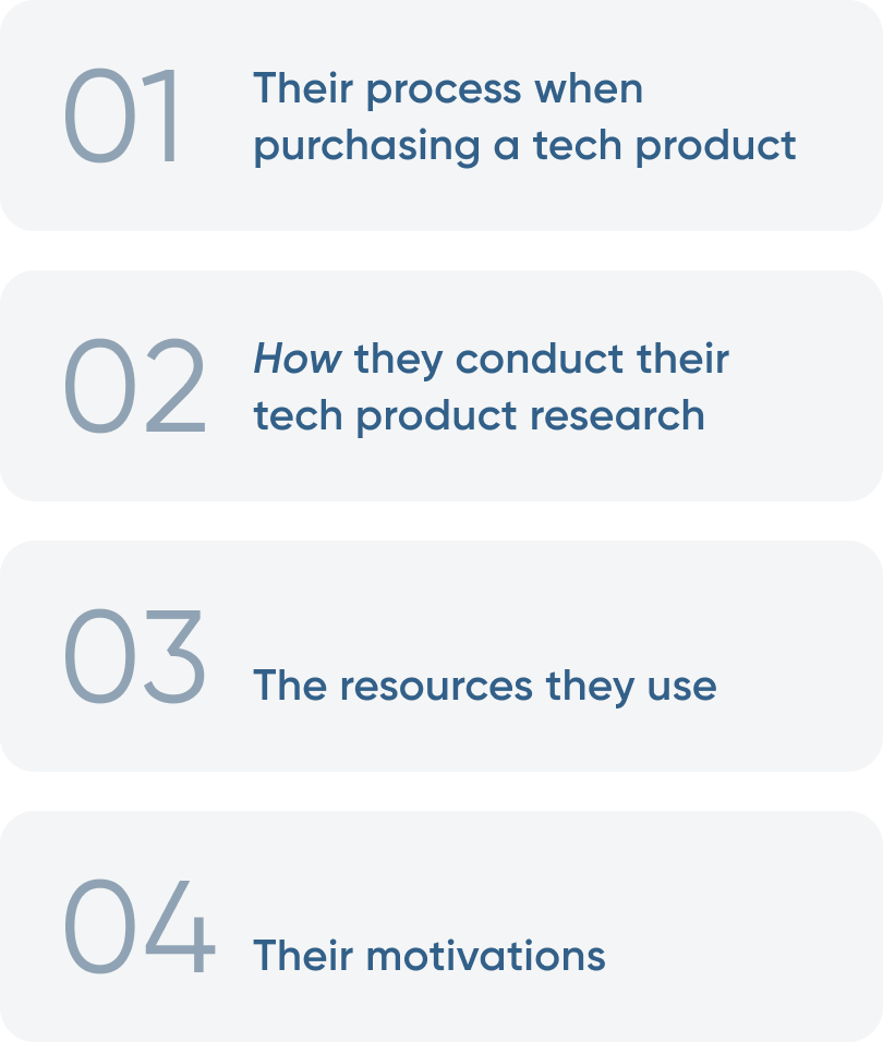
The Current Research Process
Based on the responses provided by the participants, a journey map was created to visually represent the current process they go through when searching for the right tech product. By mapping out the journey, I was able to recognize the steps involved in the process and brainstorm ways to streamline it.

Research Insights

Key Insight #1
Reading Reviews
Learning About Other Peoples' Experiences
Reading reviews plays a significant role in the research process because learning about experiences and feedback from other people guides users to view a product a certain way.
Opportunity: To provide users the freedom of writing reviews and sharing their experiences, user engagement is a key factor. A social media platform approach would help encourage user interactions.

Key Insight #2
Viewing Visuals
Analyzing a Product in Its Entirety
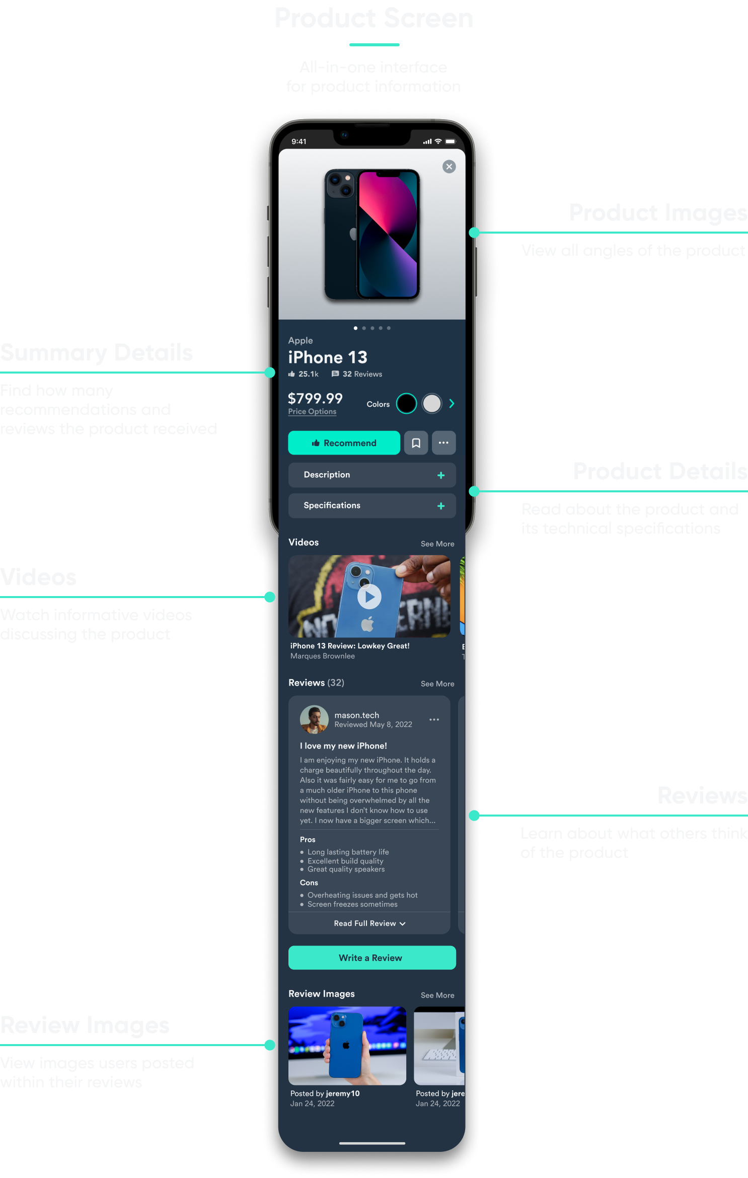
Viewing visuals, whether it be product images or videos, is essential when doing research because users need to analyze a product in its entirety. Providing enough visuals of a product will allow the user to fully understand its form and function.
Opportunity: Showcasing visuals and specification details of a product in one convenient location would reduce the number of channels users need, making the research experience smoother.

Key Insight #3
Prioritizing Budget
Narrowing Down Potential Options
Prioritizing the budget drives the research process and establishes a financial criteria when exploring options. Users consider a budget early in the research process to help narrow down potential options.
Opportunity: Users would need an advanced search filter feature to help reveal tech products within a certain price range.
02 Turning Insights Into Designs
Main User Flows
After reviewing the key insights and considering the design opportunities, I began to structure the foundation of an improved user experience. From this, 3 main user flows were established.

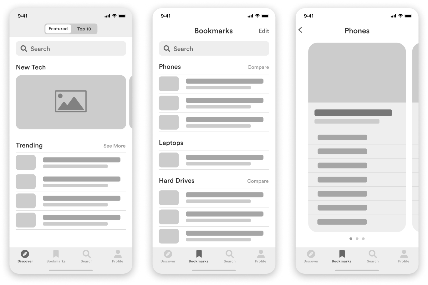
How the Research Experience
Was Approached
When designing the product research experience, key concepts that were considered included:
- A homepage that showcases popular tech products in a creative way
- A feature that bookmarks products
- The ability to compare different options
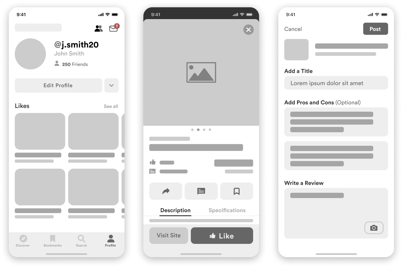
How the Social Experience
Was Approached
Key concepts that would enhance the social and interactive experience included:
- The ability to build a user’s profile
- A simple way to recommend a product
- A user-friendly interface when writing a review
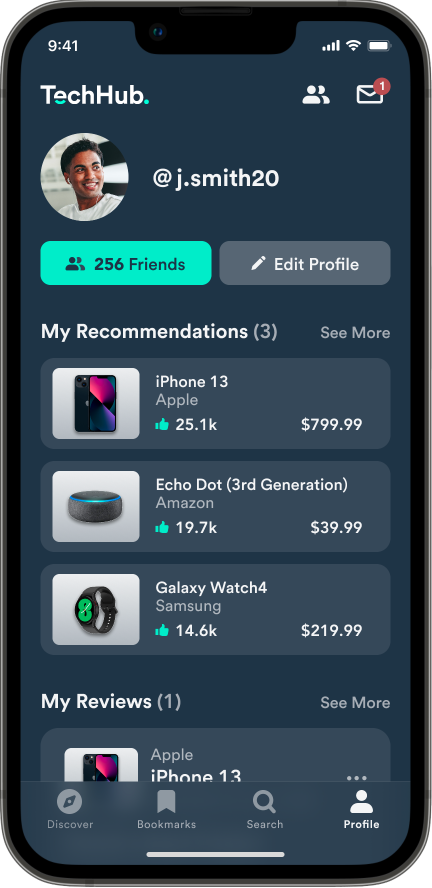
Onboard
Build Your Profile
During the onboarding process, users are encouraged to begin building their profile by selecting products they would recommend to others. Their selections will appear on their profile screen, allowing other users to view their taste in tech products.
Connect
Share Your Experiences
Users can recommend their favorite tech products and post reviews containing their experiences, likes, dislikes, and product images.
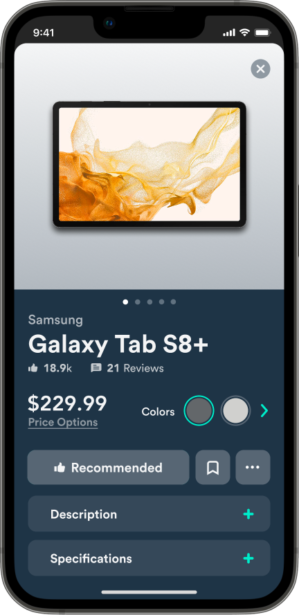
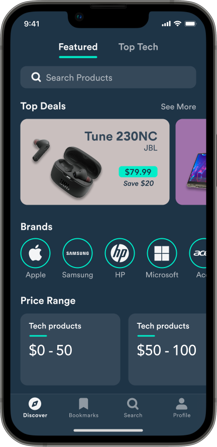
Discover
Explore Popular Tech
Tech products that are highly recommended by other users become easier to discover.
03 User Feedback
Version 1: Before
Pain Point #1
Comparing Bookmarked Products
A major pain point most of the participants experienced during testing was the compare
feature. Based on their feedback, participants:
- Were not sure if the product was bookmarked or not
- Did not know where the bookmarks were saved
- Could not find the compare feature

Incorporating UX Heuristics
UX heuristics were incorporated in the design revisions to improve the user experience and reduce the number of steps taken when completing the task.

Version 2: After
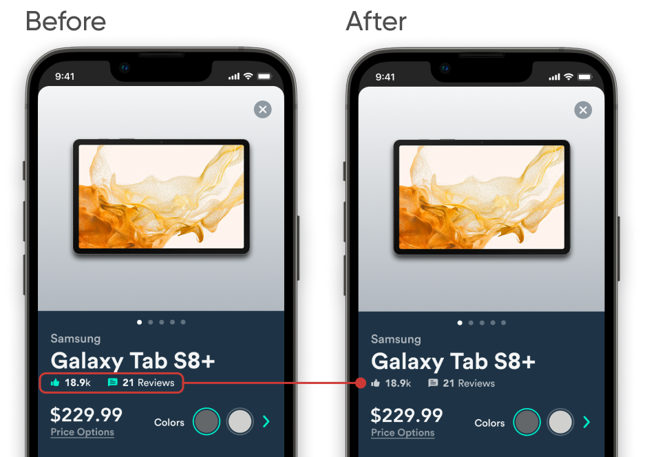
Pain Point #2
Text Consistency
It was noticed that some users tapped the "likes" and "reviews" labels. However, they were not intended to be buttons, so the text was changed to gray to let the user know they are not clickable.
Pain Point #3
Label Clarification
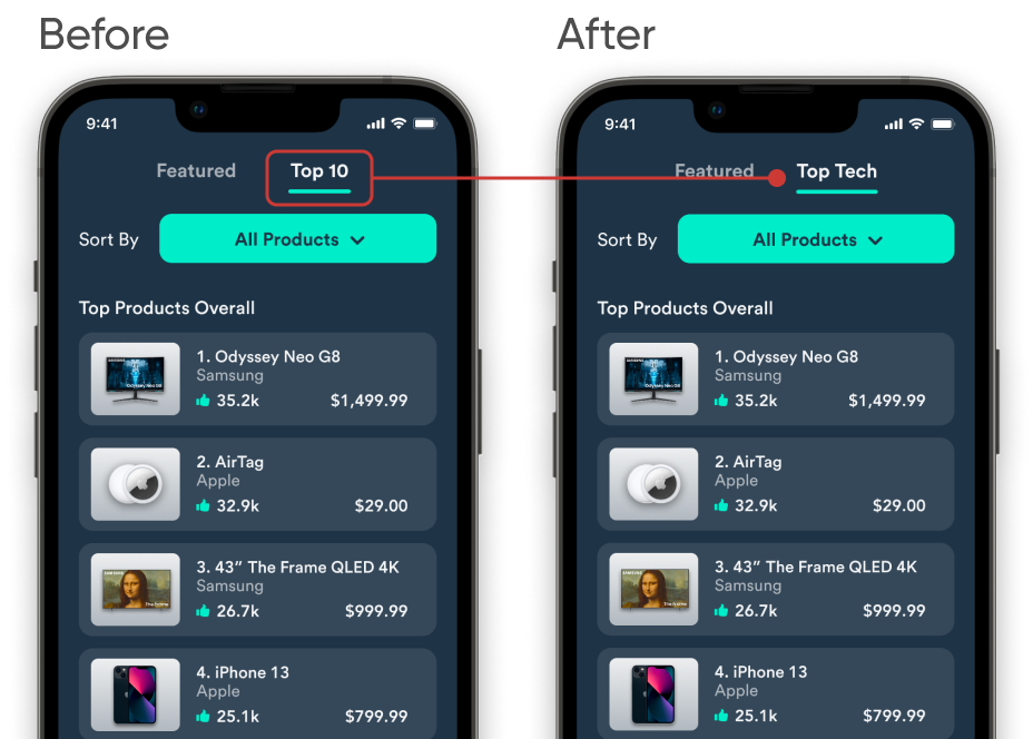
There was some confusion regarding what the Top 10 tab displayed. Some thought it revealed the top 10 friends, while others thought it showcased the top 10 articles. For clarification, the label was changed to Top Tech.
Final Thoughts
Takeaways
This project gave me the opportunity to not just consider the user and their values, but also approach a challenge holistically and work to connect all the dots. As a result, we are presented with a platform that reduces the number of channels used during product research and allows users to connect with others in the tech community.
Next Steps
- Implement a way users can dislike a product
- Create a reward system to incentivize users to recommend products and write reviews
- Focus more on the social media side by improving user discoverability
Discover more
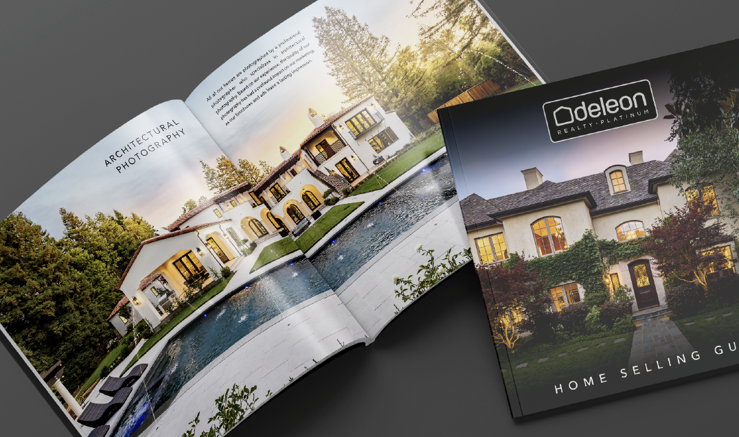
Platinum Home Selling GuideProject type
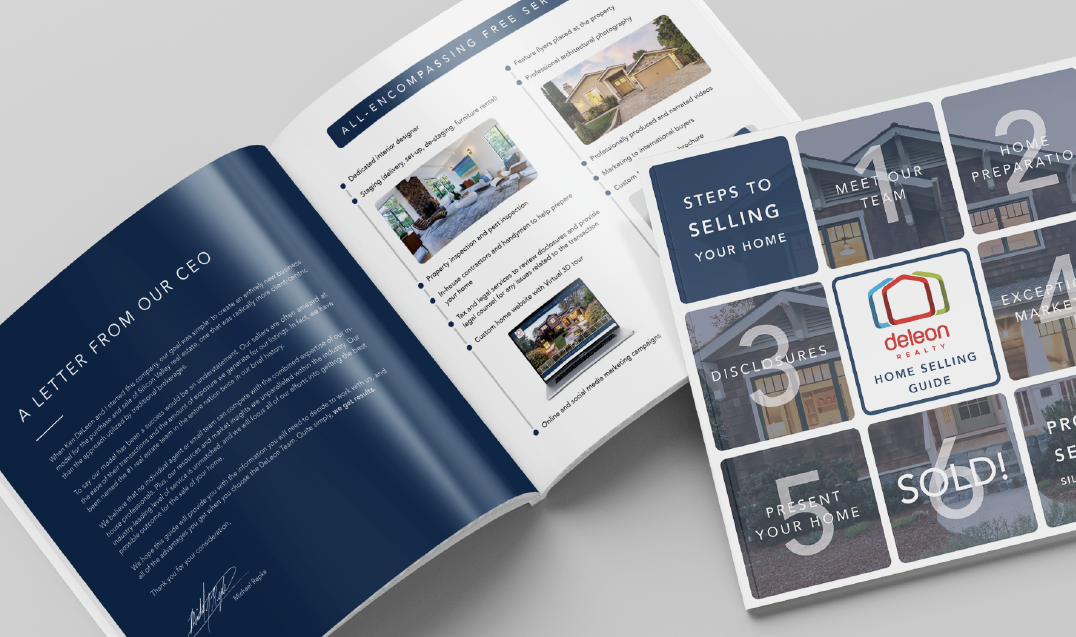
Standard Home Selling GuideProject type

Property AdvertisementsProject type
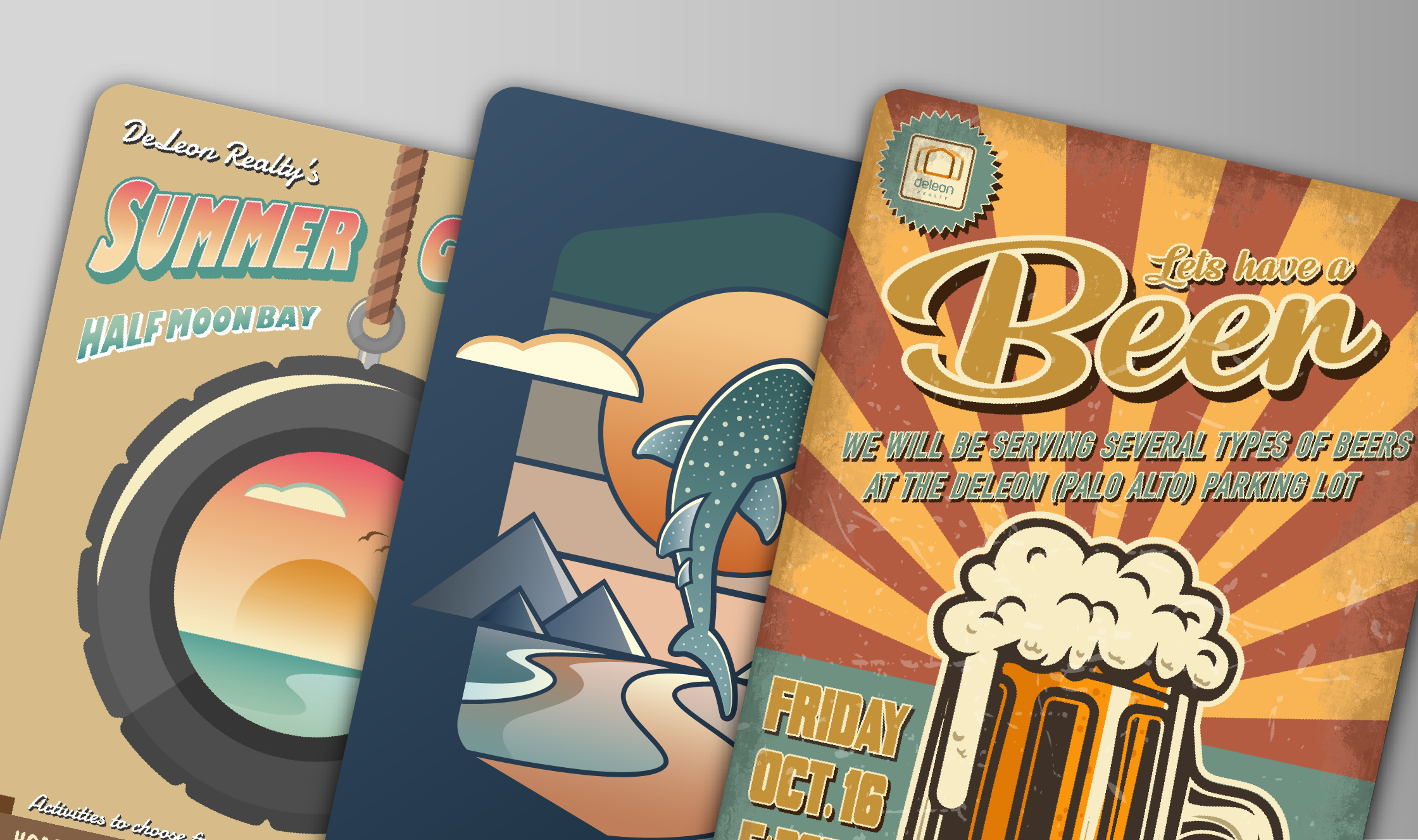
Illustrative ArtProject type
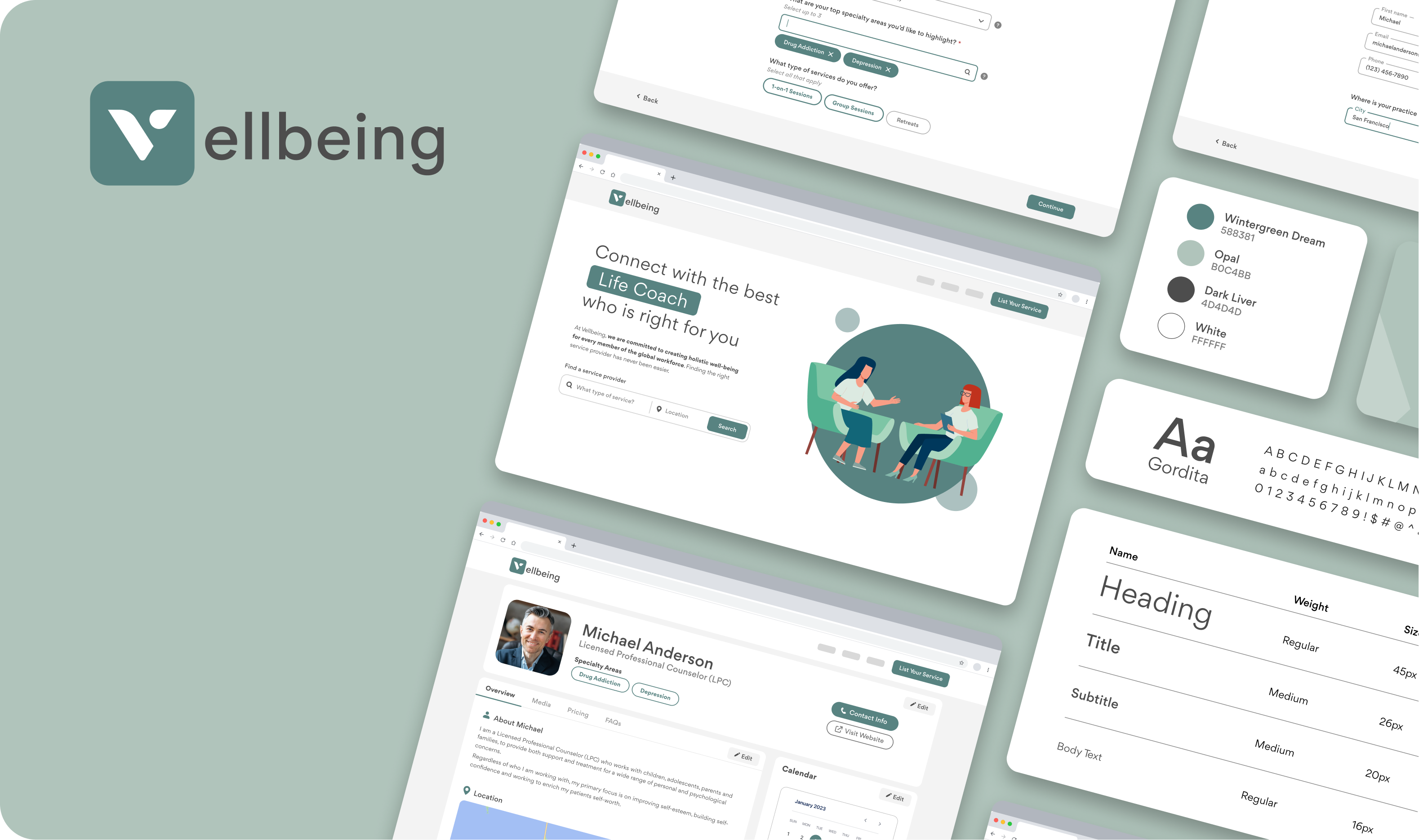
VellbeingAn easy-to-follow onboarding experience that brings wellness providers one step closer to connecting with their clients.
DeLeon RealtyProject type
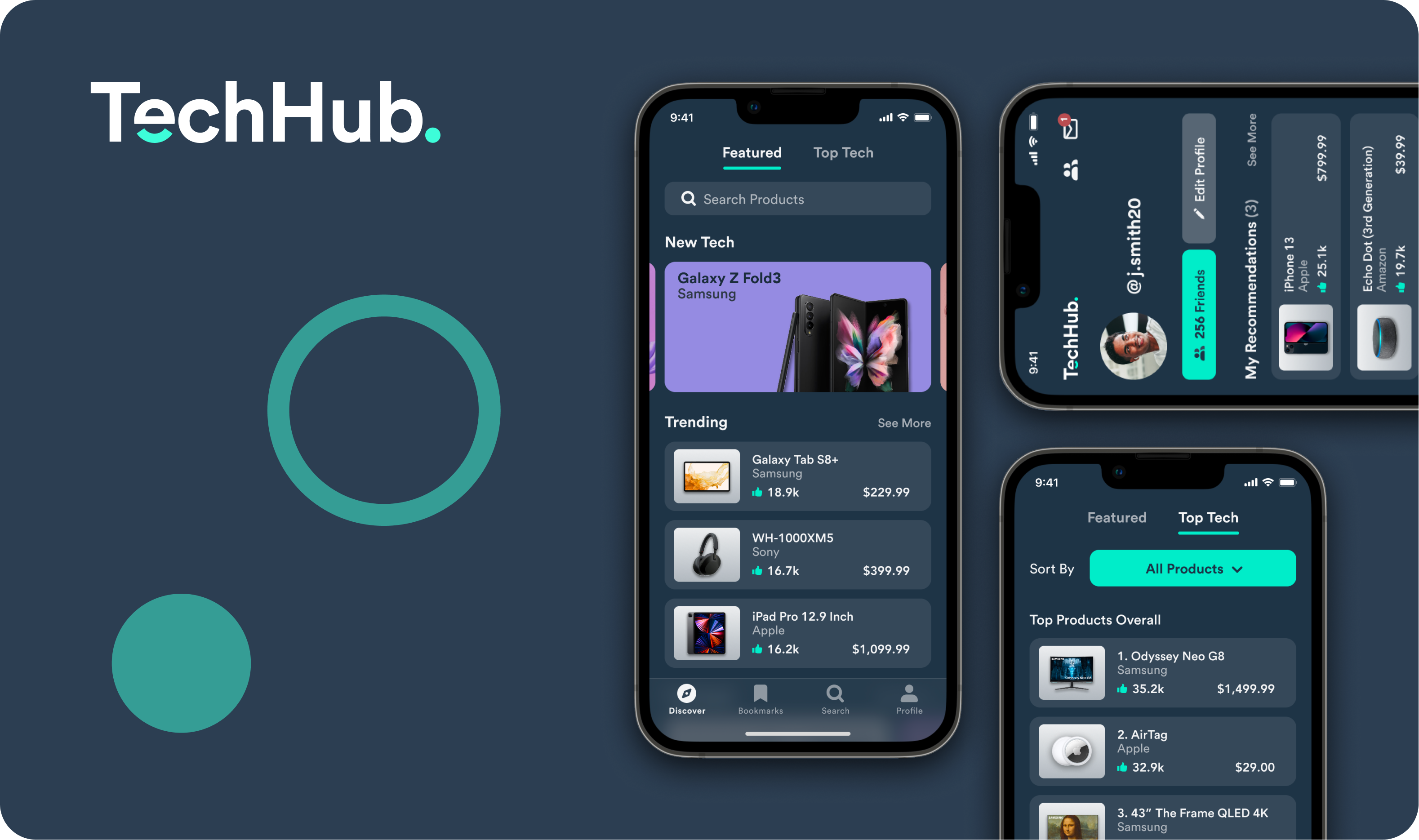
TechHub.Project type
Let's Connect
branrabanal@gmail.com
